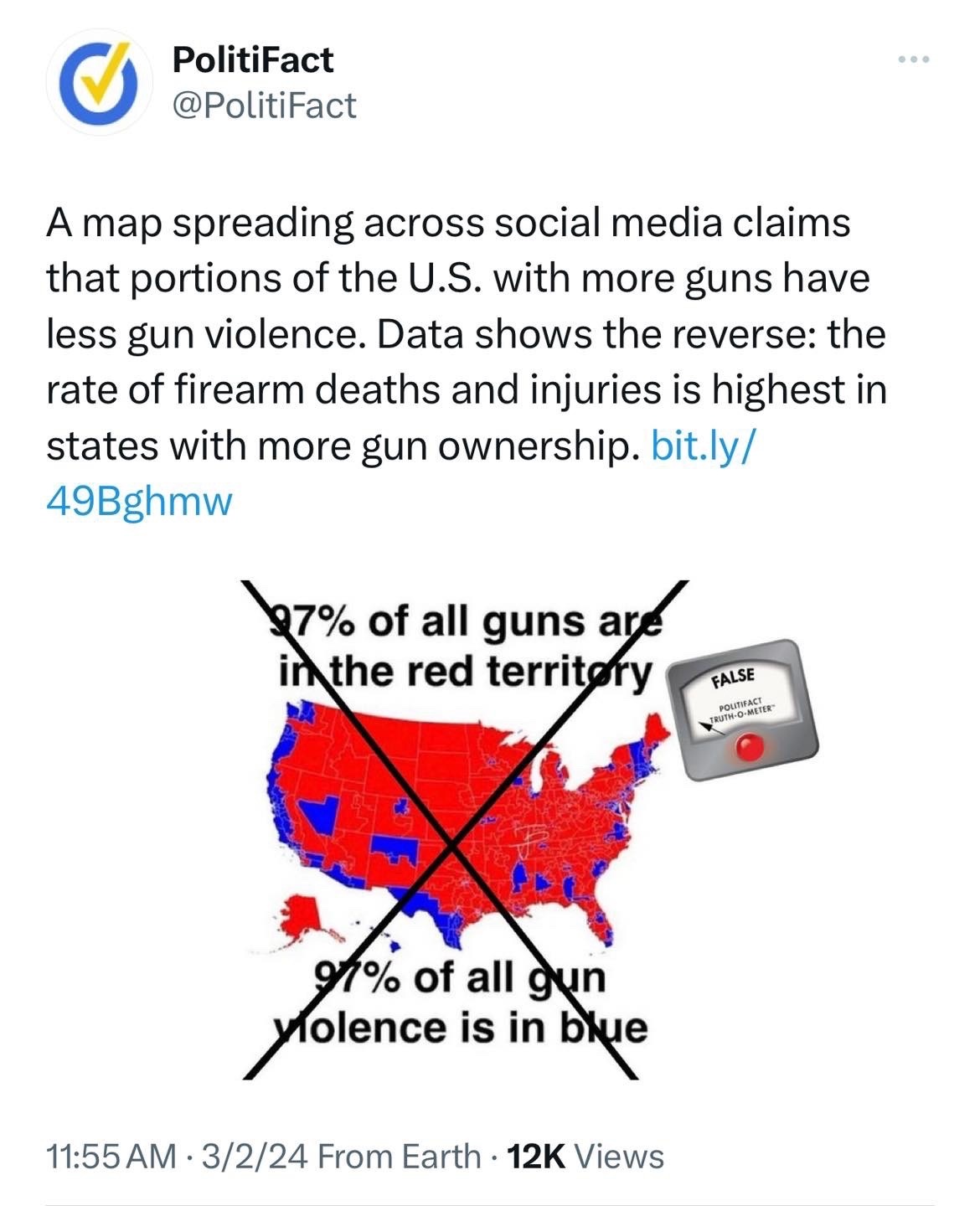
The meme is bs (it’s a political map from 2016 not a gun violence map) but the fact check is too. Politifact switches it from red/blue areas to STATES. But often the areas in red states w/high gun violence are blue areas (New Orleans, St. Louis, Cleveland, etc.)
The meme suffers from other logical issues. There’s no way to know where all the guns are but it’s highly doubtful 97% are in the red areas. The blue areas are where the bulk of the population lives so you would assume where the bulk of the violent crime is too (but again 97% seems to be pulled from thin air).
So many of these right wing accounts are just whiners now, this is a diatribe about automatic sinks and towels, the horror! As I explained in a prior post, most of the newer terminals have great bathrooms, some now have completely private stalls and plenty of them. The worst and most crowded airport bathrooms are invariably found in aging terminals that are decades old. It’s a reminder that airports were usually drab and uncomfortable.
I think the heyday of the air hand-dryers was like 15-20 years ago, where often you couldn’t find real towels. Now you can at least usually get real paper towels in airport bathrooms. Remember those old cloth roller towels that would go in a loop and somehow “clean” themselves? Yuck! Public bathrooms have always been gross, it seems some are deliberately having selective memories.
Airport food and drinks were always expensive, but now practically everyone brings those huge cooler flasks with them and fills them up. So not sure what he means that ...

I first critiqued this terrible take by looking at how food has actually improved substantially. Even though I said the same could be done in every category, people said “you’re only doing food.” So let’s do air travel and see why it’s not gotten better, not worse.
▪️Aircraft have greatly improved. Just 15-20 years ago, many domestic routes (~15%) were flown by turboprops like the Brasilia, Dash 8 or Saab. Now, almost everything is in jets, and most aircraft have WiFi. Some even have Starlink, where you probably have faster WiFi than your home. Most major airlines offer dozens or hundreds of movies and shows to watch.
▪️Newer designs like the 787 have lower cabin altitudes and improved humidity, which make a huge difference in passenger comfort on long haul flights. The first/business class international market has gotten very competitive globally, with many carriers offering excellent service and amenities. Pods, suites, showers, etc. Coach still sucks but is dramatically cheaper ...
This is the complete opposite of an empirical fact. The right has now joined the left in being pessimistic about the modern world and completely unappreciative of the amazing abundance we now have. I’ll just focus on food here, but you could do it for almost every category.
▪️Fresh produce used to be available only in season. In the winter it was canned or frozen. People used to send fruit for Christmas gifts, it was that much of a luxury good. Now, you can get giant, sweet berries year around in every grocery store. Corn on the cob in February. Not to mention once rare items like dragon fruit, heirloom tomatoes or baby bok choy.
▪️If you didn’t live on the coast, seafood was either not available, frozen, or extremely expensive. If you lived in the Midwest and traveled to coastal locales you would quite literally be able to eat food you had never seen. Salmon has become much more abundant and accessible. You can get fresh ahi at Walmart today. Sushi and oyster bars exist everywhere ...